
OS-independent colour scheme with PySide6
-
Dear QT Forum,
we are a very small university group (most of the time I am alone, sometimes one student assists) who created and maintain an open-source application, https://github.com/hanspi42/signalflowgrapher. The original student team developed it with PyQT5. We recently ported it to PySide6, which observes dark/light mode. The app looks very ugly in Windows dark mode, so we have blocked the dark mode on Windows in the development version. While I am a proficient Python developer, I am unfortuately a QT rookie.
My first instinct would be to just set the colour palette to be the same on all operating systems. Looking through documentation and forums, I have found many things, like ui Designer, loading palettes from a file, using style sheets, but I could not determine what would be best practice such that it will also be easily maintainable in the future.
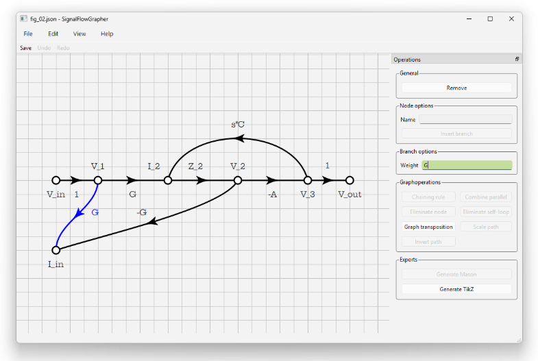
Could anyone tell me the following: my App looks like THIS on Win 11 light mode. I want it to look very similar on all operating systems. How should I proceed?
THIS:
-
The QPalette does not work reliably as still OS specific functions are used for drawing controls which sometimes don't respect the palette. The only thing reliable are stylesheets. However, sometimes setting a stylesheet will slightly change other things as well so that you need to either accept those small changes or try to work against them. One thing that immediately comes to mind is that after setting a style sheet the default buttons of a QDialog don't have the same width anymore.
It is really hard to come up with a consistent stylesheet. A long time ago we started with the qdarkstylesheet (probably this one https://github.com/ColinDuquesnoy/QDarkStyleSheet), just copying the stylesheet from that repo (because we are using C++). It didn't have a light mode back then. So, we changed the stylesheet so that we can replace the colors with either light colors or dark colors (by replacing every occurence of a color with
%1,%2, etc. in the stylesheet, load the stylesheet as QString and provide the correct colors as args). By now, this has a dark and light mode. Using a full stylesheet means that your app looks exactly the same on all platforms.I would assume that you can make your app work with a dark mode quite easily. But, I would also expect that your graphing area should also have a light background in dark mode (everything else is usually quite confusing).
(You could also try to use the Fusion style on all OSes. This might work with a palette because it is a Qt style compared to OS specific styles.)
@SimonSchroeder Thank you very much, that confirms what I thought and feared.
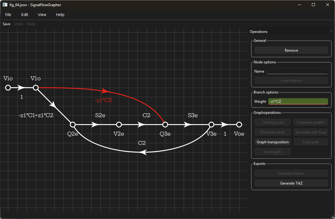
So I spent a few hours today making our app work with the dark mode. It was easier than I thought, and it looks reasonably nice now in both modes and, on Win 11 at least, even uses the OS's accent colour to highlight stuff.
Two of my students who looked at it are fine with the dark canvas, as Signal-Flow-Graphs are monochromatic by nature. I do wonder, though, whether I should make the lines thinner in dark mode, right now the white on dark graph looks heavier than the dark on white,
I have already pushed it to github in case anyone is interested in seeing the code. I guess it is ready for release, pending internal review ^^
-
H hanspi42 has marked this topic as solved on
-
Hi and welcome to devnet,
On the subject of line thickness, I would say no as for my eyes they already look thinner in dark mode.
On an other topic, I am wondering whether the red should be a bit darker in the the dark mode. It feels a bit aggressive (again just personal taste) -
Hi and welcome to devnet,
On the subject of line thickness, I would say no as for my eyes they already look thinner in dark mode.
On an other topic, I am wondering whether the red should be a bit darker in the the dark mode. It feels a bit aggressive (again just personal taste) -
Hi and welcome to devnet,
On the subject of line thickness, I would say no as for my eyes they already look thinner in dark mode.
On an other topic, I am wondering whether the red should be a bit darker in the the dark mode. It feels a bit aggressive (again just personal taste)@SGaist said in OS-independent colour scheme with PySide6:
I am wondering whether the red should be a bit darker in the the dark mode.
This could certainly help. In the same way, it could help to make the white lines a light gray instead.
-
@SGaist said in OS-independent colour scheme with PySide6:
I am wondering whether the red should be a bit darker in the the dark mode.
This could certainly help. In the same way, it could help to make the white lines a light gray instead.
@SimonSchroeder said in OS-independent colour scheme with PySide6:
@SGaist said in OS-independent colour scheme with PySide6:
I am wondering whether the red should be a bit darker in the the dark mode.
This could certainly help. In the same way, it could help to make the white lines a light gray instead.
I'd love to do that, but there lies my "Qt rookie" problem again, I see many ways but don't know best practice. I have presently used roles everywhere, and the lines have the "text" role which makes them white in Win 11 dark mode. When a light/dark switch happens while the app is open, QT6 does everything for me, except the green background of the "Weight" input field, which signifies a valid SymPy expression. I made that with style sheets, so it updates only when the field redraws. Right after a dark-to-light switch the field will still be a darker green with white text.
Would the proper way be to do the gray line with style sheets, detect a mode change, and redraw, or can I add roles that then update automatically at light/dark switch? Or should I work with two palettes?