Stylesheet for the arrows on the QListView of a QCombobox
-
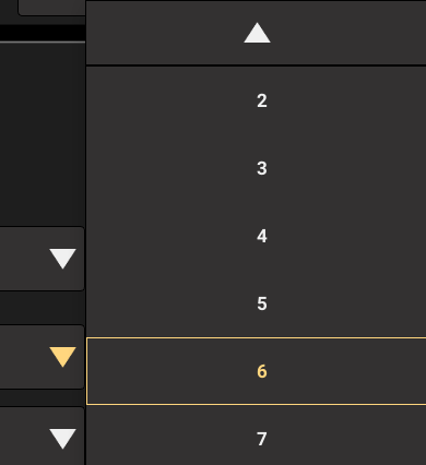
I'm trying to create a stylesheet for a QCombobox and this is the QListView that pops when I select the QCombobox. How can I style those arrows on the top and bottom of the list?
I found references to the arrows on QScrollBar, but i can't find references to these two. -
I'm trying to create a stylesheet for a QCombobox and this is the QListView that pops when I select the QCombobox. How can I style those arrows on the top and bottom of the list?
I found references to the arrows on QScrollBar, but i can't find references to these two.@CDieguez https://doc.qt.io/qt-6/stylesheet-examples.html
See "Customizing QComboBox" -
@CDieguez https://doc.qt.io/qt-6/stylesheet-examples.html
See "Customizing QComboBox"@jsulm Sorry, I'm just not seeing it.
I'm already styling "QComboBox::down-arrow" and "CComboBox::drop-down" to make the combobox look like this.
For smaller lists, those arrows don't appear and it looks fine.I styled "QComboBox QAbstractItemView { " to set the padding, background color, selection color, item selection border for the itens on the ListView.
The only things in the example I'm not using are the "on" and "editable" states. I'm not planning on allowing the user to edit the combobox and I don't want it to look different if it's on or not.
To see if I could change the color of those arrow buttons to red, I literally tried styling something similar to the example below for every sub-control on the List of Sub-Controls in this link https://doc.qt.io/qt-6/stylesheet-reference.html#sub-line-sub, but nothing changed those two buttons.
"CComboBox::down-arrow {"
     "background-color: red;"
"}"
"CComboBox::float-button {"
     "background-color: red;"
"}"
"CComboBox::indicator {"
     "background-color: red;"
"}"
...
I'm just looking for the name of these sub-controls or if they should be addressed as another class instead of a sub-control. I really would appreciate an example like the ones above that could turn those two arrows red or set an image or change them in any way.
-
Using AI to search inside Qt 5.6.3 base code, it suggested this code to manipulate these arrows. I'd prefer using qss, but this approach actually worked.
// Event filter to customize the painting of QComboBoxPrivateScroller widgets
class ScrollerPaintFilter : public QObject
{
public:
  ScrollerPaintFilter(int button_height, QObject* parent = nullptr)
    : QObject(parent), button_height_(button_height) {}

protected:
  bool eventFilter(QObject* obj, QEvent* event) override
  {
    if (event->type() == QEvent::Paint)
    {
      QWidget* widget = qobject_cast<QWidget*>(obj);
      if (widget)
      {
        QPaintEvent* paintEvent = static_cast<QPaintEvent*>(event);
        QPainter p(widget);

        // Fill background
        p.fillRect(widget->rect(), QColor(gray);

        // Draw border
        p.setPen(QPen(Qt::black, 1));
        p.drawRect(widget->rect().adjusted(0, 0, -1, -1));

        // Determine if this is up or down scroller by checking y position
        bool is_down = widget->y() > widget->parentWidget()->height() / 2;

        // Draw arrow icon
        QPixmap arrow(is_down ? "down.png" : "up.png");
        int icon_x = widget->rect().center().x() - arrow.width() / 2;
        int icon_y = widget->rect().center().y() - arrow.height() / 2;
        p.drawPixmap(icon_x, icon_y, arrow);

        return true; // Event handled, don't call original paintEvent
      }
    }
    return QObject::eventFilter(obj, event);
  }

private:
  int button_height_;
};

void ComboBox::showPopup()
{
...
  // Get the popup widget
  QWidget* popup = view()->parentWidget();

  // Customize Qt's built-in scroll indicators (top and bottom arrows)
  // These are QComboBoxPrivateScroller widgets that Qt creates automatically
  QList<QWidget*> children = popup->findChildren<QWidget*>();
  ScrollerPaintFilter* filter = new ScrollerPaintFilter(popup);

  for (QWidget* child : children)
  {
    if (child->inherits("QComboBoxPrivateScroller"))
    {
      // Set fixed height to match button height
      child->setFixedHeight(button_height);

      // Install event filter to custom paint the scroller
      child->installEventFilter(filter);
    }
  }
...
}