
How can i set default TextField Border with current Style
-
I have a pretty dynamic TextField which you can see in the picture. No visible border unless it's clicked then the placeholderText moves inside the border which i quite like. However since i want the border to be grey to match the background in case the TextField is greyed out i set the Background to disabledBackground. This works fine, however i can't return to default afterwards.
I've tried the Componenet with an empty Background implemented as enabledBackground and I've tried setting the background to null which also didn't work.
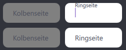
As you can see in the pictures the border is not visible anymore when i click the TextField. This happens only when the background was set to something before.
Good:
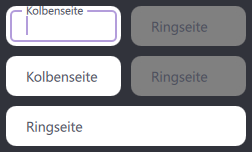
Bad:
           Component {
                id: disabledBackground
                Rectangle {
                    color: "transparent"
                    border.width: 1
                    border.color: "grey"
                    radius: 10
                }
            }

            Component {
                id: enabledBackground
                Rectangle {
                }
            }

            TextField {
                id: textField
                anchors {
                    fill: parent
                    leftMargin: 4
                    rightMargin: 4
                    topMargin: 4
                    bottomMargin: 4
                }

                verticalAlignment: Text.AlignVCenter
                placeholderTextColor: "#4b4e5c"
                color: "black"
                font.pixelSize: 14

                onEnabledChanged: {
                    if (!enabled) {
                        background = disabledBackground.createObject(this)
                    }
                    else{
                        background = enabledBackground.createObject(this)
                    }
                }

                placeholderText:
                    Array.isArray(root.placeholderText)
                    ? (index < root.placeholderText.length ? root.placeholderText[index] : "")
                    : root.placeholderText

                onTextEdited: {
                    root.values[index] = text
                }

                enabled: root.fieldEnabled[index]
            }
To cut my question short: How do i set the Background to the default based on the Material used. (not empty Rectangle, not null)
-
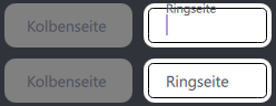
I have also tried taking the implementation directly from the TextField.qml file from the Material Style which results in this behaviour:
As you can see it is always visible and doesnt "make space" for the placeholder Text.
            Component {
                id: enabledBackground
                MaterialTextContainer {
                    implicitWidth: 120
                    implicitHeight: control.Material.textFieldHeight

                    filled: control.Material.containerStyle === Material.Filled
                    fillColor: control.Material.textFieldFilledContainerColor
                    outlineColor: (enabled && control.hovered) ? control.Material.primaryTextColor : control.Material.hintTextColor
                    focusedOutlineColor: control.Material.accentColor
                    placeholderTextWidth: Math.min(placeholder.width, placeholder.implicitWidth) * placeholder.scale
                    placeholderTextHAlign: control.effectiveHorizontalAlignment
                    controlHasActiveFocus: control.activeFocus
                    controlHasText: control.length > 0
                    placeholderHasText: placeholder.text.length > 0
                    horizontalPadding: control.Material.textFieldHorizontalPadding
                }
            }